Corows Data Platform
Redesign and Rebranding of Corows
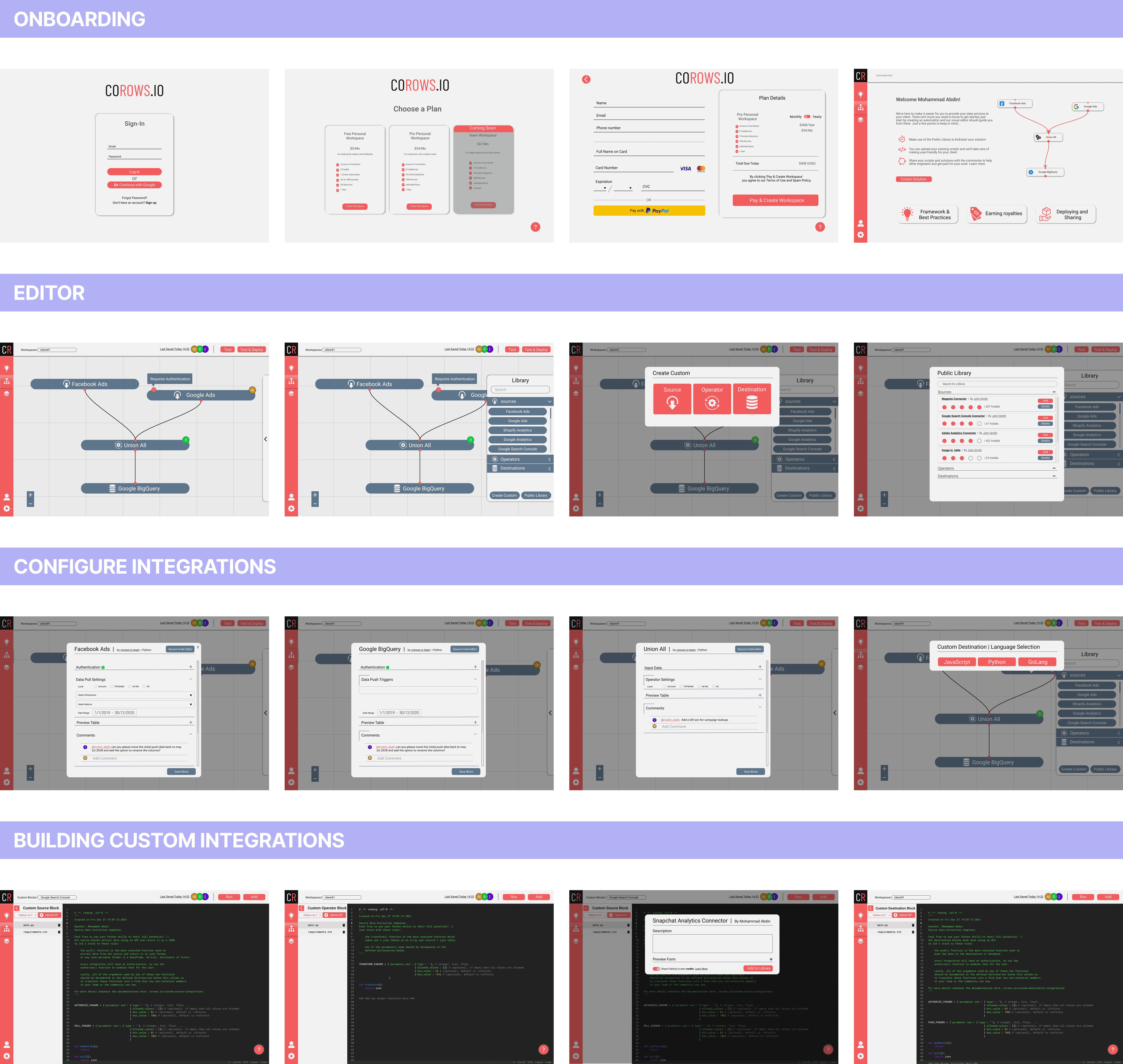
Corows is a data platform for modern digital agencies. This case study outlines the dual objectives of improving the user interface and executing a complete rebranding. The project was a collaboration between me and the co-founder.
January 2023
I initiated the project by conducting a thorough audit, including a heuristic evaluation of the current experience and key user flows. This diagnostic phase revealed inefficient search capabilities and a complex data model structure, among other issues.
Design Sprints and Ideation
In lieu of traditional OOUX methodologies, I opted for a straightforward component mapping exercise. This helped in shaping the Information Architecture and clarified the project scope.
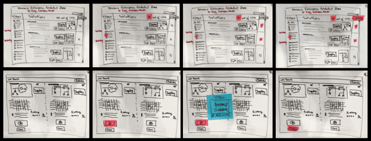
Utilising the Google Design Sprint methodology, the co-founder and I engaged in a series of design sprints to brainstorm solutions.
I took the lead in the rebranding process, designing a new logo, a fresh color palette, new typography, and custom brand icons to align the platform's visual identity with its core values and target audience.
Post rebranding, I developed a new component library that encapsulated the fresh visual identity. This library ensured consistency across the platform and was meticulously documented to aid developers and future designers in maintaining brand coherence.
Final Designs and Development
The UI components and visuals were finalised and aligned with the new brand identity, in coordination with the co-founder.


